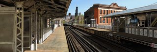
 Click on the link above and feast your eyes on a spectacularly painstaking computer graphic. The artist, Bert Monroy, used Adobe's Photoshop and Illustrator to recreate this Chicago subway platform.
I'm a graphics guy but I can only wish to have the time and patience to make such an image.
For non-graphics people, here's the basics: We've all filled in a color-by numbers -- putting colors into outlines to create an image. The linked image is the same concept, except the artist created the outlines also.
The outlines (hundreds of thousands) were created in Illustrator, a vector-based program (vector programs work in geometrical shapes). The colors and textures were achieved in Photoshop, a raster-based program (raster programs work in dots.)
This image combines the two techniques with overwhelming precision.
Be sure to scroll down and see the mind-bending attention to detail.
This reminds me of the equally obsessive computer graphic "The Wet Bird" by Gilles Trans -- a ray-tracing graphic so photo-realistic that other ray-tracers thought the artist just took a snapshot. Peers became convinced when the artist posted a detailed explanation of how the image was made. (Graphics people, be sure to read the explanation of how the blurry figure with the umbrella was created.)
No comments:
Post a Comment